Font of Wisdom
© 2000 Lawrence I. Charters
Washington Apple Pi Journal, March/April 2000,
pp. 21-23, reprint
information
Macintosh computers have been with us for a long time,
but most people still don't know how to use them properly.
Not just a few, mind you, but: most.
As proof, just look at almost anything written by Mac
users over the past decade and a half. Given that the
Macintosh almost single handed (neat trick for a limbless
computer) revolutionized the world of typesetting, it is
shocking to see how many letters, memos, reports, and other
bits and pieces of text produced on such marvelous machines
look like they were produced on: typewriters.
While this aberration is most pronounced in and around
Washington, DC (where "innovation" often means getting rid
of the new and going back to the old), this blight is
present almost everywhere. Hardly a day goes by without a
church flyer or some other organization brochure falling out
of the mail, printed in several different sizes of Courier,
a monospaced font invented for the IBM Selectric typewriter
(in 1961). Or entire letters written in Chicago, a font
designed (in 1983) specifically for the Mac's menus, and
nothing else.
So, as an intellectual exercise, let us consider a
brand-new shopping mall that wants to promote its stable of
upscale stores for the discriminating shopper. Here is how
the federal government would list the stores, using Courier,
of course:
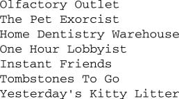
While there is nothing wrong with such a list, it tends
to look sterile and colorless. Another problem with Courier
(and all other monospaced fonts) is that it is harder to
read: the eye has to travel the same distance for thin
letters, such as j, as for wide ones, such as w. This makes
it more tiring to read things written in Courier, as the
eyes must travel farther and work harder.
Listing the stores in Palatino, a popular serif font,
adds an almost instant elegance:
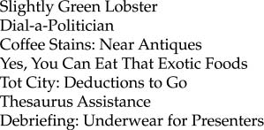
Palatino, by the way, is the font used for body text in
the Washington Apple Pi Journal. If you take a look
through your home, you'll soon discover that virtually every
book, magazine, and newspaper uses a serif type for body
text. Government reports, of course, usually use Courier,
since they are apparently supposed to be hard to
read.
Some people take the idea of "elegance" a bit too far,
and use calligraphic fonts to "add style." Calligraphic
fonts are definitely elegant, subtly suggesting days of yore
when all text was written by hand using quills:
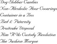
Before you write something in a calligraphic font (in
this case Nuptial Script), there are a few things to keep in
mind. First, writing with quills is hard on geese. Second,
calligraphic fonts are hard to read. While it might be fine
for a once-in-a-lifetime event, like a marriage, for lesser
purposes it is exasperating. Roughly once a week, a letter
or a flyer arrives in the mail written entirely in
calligraphic fonts (note: usually more than one). These are
quickly dispatched to the recycle bin, unread.
This does not, of course, mean that everything should be
written in Palatino and other serif fonts. Traffic signs,
for example, are always written in sans-serif fonts: they
have simple messages, and want to make their point quickly
and emphatically. In our upscale mall, the mall directory
would be a good place to have a sans-serif font, such as
Optima:
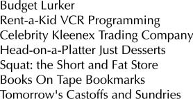
Optima, and other sans-serif fonts, should not be
overused. Some Web sites, for example, use sans-serif fonts
for everything because it looks different.
Unfortunately, it doesn't look different if overused; it is
the contrast with serif type that makes it look different.
An important point to consider: while very small children
might read letter-by-letter, literate readers read by the
shapes of words. Serif fonts, such as Times (the most
popular font in the world), Palatino, and Garamond (all
Apple advertising is done in Garamond), are easier to read
in small sizes. The serifs at the end of strokes make the
letters more distinctive, giving the words more of a shape.
Using proper capitalization also gives the words more shape.
To illustrate this, consider the worst abuse of
typography in the 20th century: the Surgeon
General's warning on packs of cigarettes. Ordered to put the
warning on all cigarette packages, the tobacco companies
decided to comply in such a way as make the warning all but
unreadable. The warning was reproduced in a san-serif font,
all upper-case, with a heavy border and unnecessary lines
thrown in, thwarting any attempt to "read by shape:"

Insurance contracts, credit card applications and other
forms use a similar tactic, making sure to obscure the parts
they really don't want you to read by writing them in tiny,
sans-serif type, all in upper case letters. "Combat
typography" must be a required course in marketing programs.
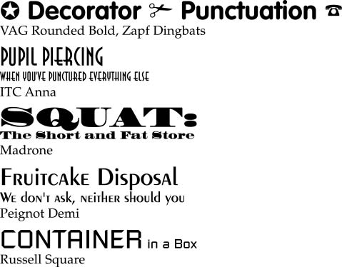
But our upscale shopping mall doesn't want to drive
customers away. Instead, we want to invite them in to spend
money, and one of the least expensive ways to do this is
through good use of typography. Good places for distinctive
typography are the signs above the store entrances:
Good typography, of course, shouldn't be limited to mall
directories or store entrances. While the body text of
brochures, leaflets, flyers, business letters and such
should aim for effortless clarity, the name of the business
-- reproduced on those same items, plus business cards,
bumper stickers, coffee mugs and other common corporate
paraphernalia -- should exhibit some creativity.
Keep in mind, too, that most of the printed world is
still black and white. A recent flyer, announcing the
retirement of a coworker, was printed in six different
colors, with six different sizes of type. Six different
colors and sizes of Courier.
Wouldn't it have been easier to read (and photocopied
much better) to write it in a careful mix of serif and
sans-serif fonts?
Further reading
Almost every issue of the Washington Apple Pi
Journal lists the programs, hardware and fonts used to
construct the Journal, usually on page 3. Flip back a
few pages and take a look. Then see if you can figure out
why we made these choices. Then tell us; we crave
reassurance.
An introduction to fonts was published in the
Journal during the 1900s, "Fonts: An Overview,"
Washington Apple Pi Journal, pp. 29-32, May/June
1999. This covers such topics as the differences between
serif, sans-serif, calligraphic and other kinds of fonts.
If you are a new Macintosh user, or a veteran Macintosh
user, or you have never, ever used a Macintosh, take a look
at Robin Williams' The Little Mac Book. Now in its
sixth edition, this is the best computer book yet written:
it presents a mass of technical information in a
non-technical, non-threatening fashion, with subtle,
splendid illustrations. There is an entire chapter devoted
to fonts that, quite frankly, doesn't touch on any of the
topics covered here. But she does tell you how your Mac uses
fonts, as well as thousands of other useful things.
Most personal computer users don't really understand how
to even type on a modern computer, much less a Macintosh.
Common punctuation, tabs, margins and other essentials
baffle them (and it shows). Robin Williams addressed these
concerns in her first book, The Macintosh is not a
typewriter, an excellent, slender volume just as
valuable today as it was a decade ago.
If you've mastered the lessons of these books, you are
ready for some heavy-duty typography, which Robin Williams
covers in two more books, How to Boss Your Fonts
Around, 2nd ed., and The Non-Designer's
Type Book. The first discusses font management on the
Macintosh: what fonts are, how they work, how they are
stored. The second discusses typography as an aesthetic as
well as an applied art form, with outstanding examples of
how to look sharp using nothing more than tasteful
typography (and talent).
You might ask: haven't other people written books about
fonts and typography? Certainly. They just aren't as good.
Robin Williams, The Little Mac Book,
6th ed., Peachpit Press, 1999, 445 pages, $19.95
Robin Williams, The Mac is not a typewriter,
Peachpit Press, 1990, 72 pages, $9.95
Robin Williams, The Non-Designer's Type Book,
Peachpit Press, 1998, 239 pages, $24.95
Robin Williams, How to Boss Your Fonts Around, 2nd
ed., Peachpit Press, 1998, 188 pages, $16.95
|


