When the Macintosh was introduced in January 1984, the first thing users noticed were the fonts. Prior to the Macintosh, computers generally displayed everything on screen in a single, monospaced font. In contrast, most of the Macintosh "city" fonts (Athens, Chicago, Geneva, London, New York, San Francisco, Venice) were proportionally spaced fonts, and only one -- Monaco -- was a monospaced font. Almost overnight, the Macintosh became a darling of amateur typographers, and hundreds of shareware fonts sprang into being.
A couple years later Apple introduced PostScript printing with the LaserWriter, and typography really took off. The LaserWriter was capable of reproducing commercial-quality printing, and the original "city" fonts were banished, replaced by Avant Garde, Bookman, Courier, Helvetica, New Century Schoolbook, Palatino, Symbol, Times, and Zapf Chancery.
Progress, however, often has casualties, as it did this time: the very simple Macintosh now seemed to be beset by all kinds of font confusion. New York looked much like Times, Palatino, Bookman and New Century Schoolbook. Are they really that much different?
Similar But Not Same
In a word, yes, they are quite different. New York was designed to look good on the Mac's screen, and is too large when printed on paper. Bookman, New Century Schoolbook, Palatino and Times are all serif fonts, but they look quite different if you look at the details. Since literate readers read by shape, rather than letter-by-letter, even subtle changes in the shape of characters can create a radically different look.
|
|
|
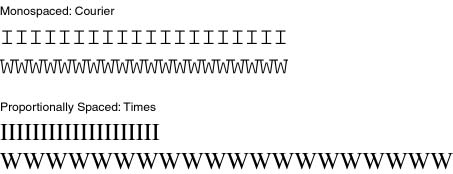
Twenty characters in monospaced and proportional fonts |
There are many different ways to classify fonts, but the most basic classifications are serif (letters have slight projections at the end of strokes) and sans serif (letters don't have anything on the end of the strokes). Generally speaking, sans serif fonts are good for headlines, signage (traffic signs are always sans serif), and anything but long passages of text. Serif fonts, on the other hand, are ideal for body copy; virtually all books, magazines and newspapers are printed in serif fonts.
|
|
|
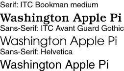
Serif and sans-serif fonts |
Once you master differentiating between serif and sans serif fonts, you'll soon realize that, while most fonts fit in one or the other classification, some don't. The five biggest exceptions are: script, casual, decorative (or novelty), grunge and dingbat fonts. Script fonts, as the name suggests, are evocative of formal hand-written script, only written by a perfect master penman. They are sometimes used in advertising, and frequently used on wedding invitations. Because they are harder to read than serif or sans serif fonts, they should not be used for body copy, unless you really don't want people to read your text.
Casual fonts are similar to script fonts, but not as precise and regular. A fairly recent innovation, casual fonts are designed to look as if they were handwritten. They are sometimes used in advertising (to give an ad or letter a "personal" look), and often used by individuals who want to write letters on a computer but make the printed version look more intimate. Well-designed casual fonts are designed to be highly readable, but you still probably wouldn't want to use one to publish a book.
|
|
|
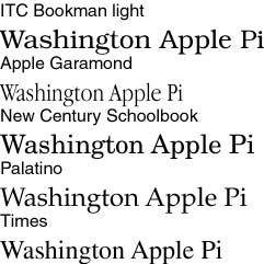
Some serif fonts. |
Decorative fonts tend to be harder to read, but reflect the old tradition of lettering as art and decoration. Aside from advertising and informal display signage, decorative fonts should be avoided. Grunge fonts, a fairly recent innovation, are "anti-fonts;" irregular lettering designed to impart an impression of rebellion, alienation or sometimes an anti-technology look. While Wired magazine seems to be fond of grunge fonts, generally speaking they have no real purpose outside of rare use in advertising and signage, such as, possibly, an advertisement for a riot or a grunge rock concert.
Dingbats, sometimes called "ornaments," are fonts that are not letters or standard type but, rather, pictures of some sort. The most popular dingbat font is probably Zapf Dingbats, though the Windows Wingdings and original Macintosh "city" fonts Cairo and Mobile are also dingbat fonts. Since dingbats are not letters, you can't use them for text; instead, they are used to emphasize the text (such as the various bullets in Zapf Dingbats) or illustrate something (such as the map symbols in Carta).
|
|
|
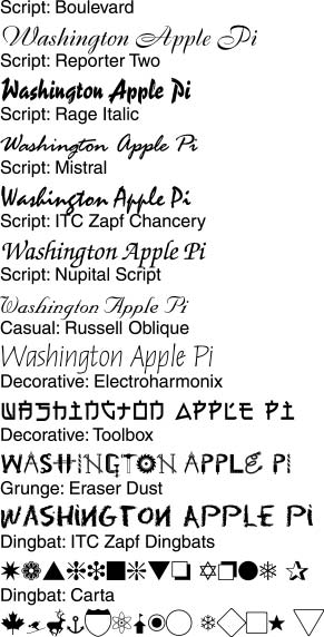
Examples of various types of fonts |
Essential Fonts
Macintosh computers are easy to customize, but one distressing way to "customize" your Macintosh is to throw away critical fonts. Every Macintosh needs three fonts to operate: Chicago, Geneva and Monaco. These three fonts are used in menus, file names and listings. Mac OS 8.5 adds some additional menu fonts: Charcoal, Capitals, Gadget, Sand, Techno and Textile.
Those with PostScript printers also need to retain several fonts that are built-in to virtually all PostScript printers: Avant Garde, Bookman, Courier, Helvetica, New Century Schoolbook, Palatino, Symbol, Times, Zapf Chancery and Zapf Dingbats. Adobe Type Manager (ATM) adds two fonts of its own that don't show up in any on-screen menu listing: Adobe Sans MM and Adobe Serif MM. These two fonts are used to "fake" missing fonts in certain cases.
Be very careful about throwing away "unnecessary" fonts. Many people think the "extra" fonts take up memory (not really) or extra disk space (they do take up disk space, but huge disk drives are very inexpensive). It can be very frustrating, trying to find out why someone's computer isn't working properly, only to discover the cause is a font thrown away as "unnecessary."
Recommendations
Typography is a subject as broad and as deep as you wish to make it. There are countless books on the subject, and entire magazines devoted to the subject. But here are some easy guidelines to good typography:
Notes
The accompanying illustrations were all created using PostScript fonts, mostly from Adobe's collections but also from other sources. Some notes about a few of the fonts:
Resources
Fonts play a large role in the Macintosh world. If you want to know more about them, run out and get a copy of Robin Williams' book, How to Boss Your Fonts Around, 2nd ed. Subtitled, "A primer on font technology and font management on the Macintosh," this richly illustrated, literately written book will tell you virtually everything there is to know about using fonts on a Macintosh. Robin covers the various types of Macintosh fonts (bitmapped, TrueType, PostScript), details how to properly install and maintain font collections, and covers a huge range of freeware, shareware and commercial font utilities. An extensive (32-page) glossary translates font terminology into something non-specialists can understand; even the glossary is illustrated.
Just as well written and illustrated, but with a different focus, is Robin Williams' The Non-Designers Type Book. Covering both Macs and Windows machines, this book is a companion to her superb The Non-Designer's Design Book, aimed at helping non-specialists create snappy-looking, professional documents through intelligent typography. Though it is a book an "average" user will find quite enjoyable and useful, the world would be a much better place if some professional designers would also read it...
Given the shocking number of people who still write everything in Courier (or Monaco, or Chicago), and still put two spaces after a period (just like they were taught in typing class, thousands of years ago), there is still a vast audience for one of Robin's first books, The Mac is not a typewriter. Published in 1990, this slender volume offers simple, expert advice on how to type your thoughts into a state-of-the-art Macintosh without it looking like something produced on a battered Smith-Corona manual typewriter.
A note to potential quibblers: Lawrence Charters does know the difference between a font, a typeface, and a letterform, but decided to use the generic Macintosh term, "font," rather than devote this entire article to explaining the differences.
![]()
Revised April 11, 1999 Lawrence I. Charters
Washington Apple Pi
URL: http://www.wap.org/journal/