|
|
|
Dear Apple,
Congratulations on shipping the Public Beta of Mac OS X! This has obviously been a monumental undertaking, with unique and clever melding of the best available technologies at every level. While in a good sense little of it is new, I believe the combination will ultimately prove to be one of the pivotal achievements in the history of personal computing.
I'd like to comment on the current Desktop application and propose a change that I believe would address many people's frustrations with it. This one application is definitely new, and has many conflicting goals. I believe it can best achieve them all by approaching some separately.
I should mention that I'm a registered developer, whose deepest roots are in the Mac OS community. But I've been thrilled to be working with Cocoa technologies ever since the morning the Rhapsody strategy was announced to us at WWDC 1997. The more I read about OpenStep and its history, the more appreciation I gained for the NeXT approach to file management and working in a networked environment. So between projects using the Toolbox API, I've also been using Mac OS X Server and Rhapsody prereleases for Cocoa and WebObjects development during this time.
|
|
|
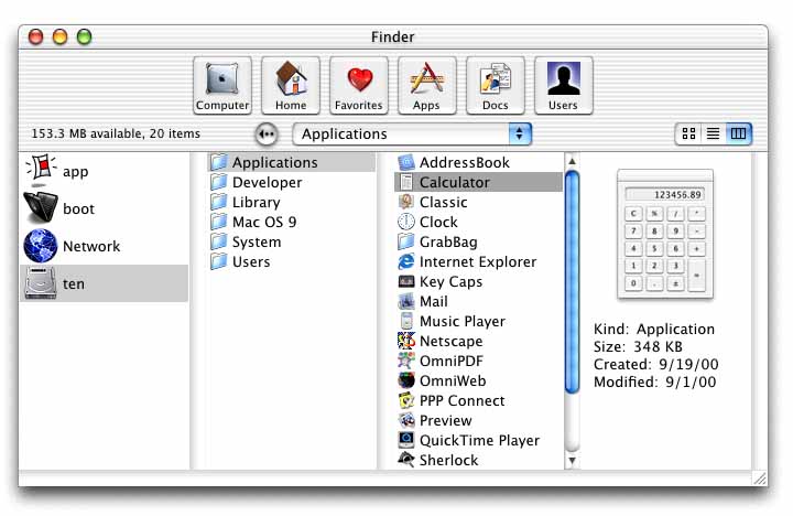
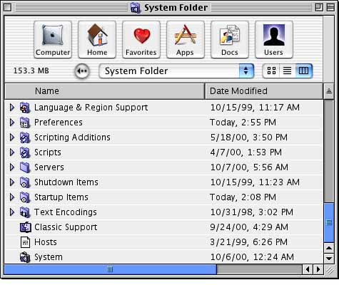
Column view at its finest: Mac OS X provides a refreshingly convenient way to burrow deep into one's machine or network and find important information. This isn't just another way to view a folder's contents. Instead, it's a new method to jump between and browse among many folders at a time. |
It took me a couple weeks to get ued to Mac OS X Server's Workspace application for manipulating files, but I've come to appreciate it for the efficiency it provides. This is especially the case when working with massively integrated networks and other deep repositories of files.
Experienced colleagues have demonstrated that Mac OS X Server's browser implementation was somewhat crippled from its own design in NeXT days through the lack of a "shelf" which could be used as a staging area for dragging and manipulating items. In my mind, this has now been solved, as both the desktop surface and the Dock serve as that staging area. However, the Icon View also serves as a tempting if awkward substitute.
|
|
|
Navigational toolbar: It's no accident that the toolbar adorning Mac OS X Public Beta's Finder windows resembles that of a web browser. There's a Back button, a History menu, and Shortcuts. These are all indispensable for browsing through vast arrays of information. But over the insistance of another leading operating system vendor, I suggest that we users don't actually desire a web browser as our main mode of manipulating our local files. This behavior should be accessed through a separate window. Note that we can neither drag items onto the shortcut buttons, nor can we open new windows by double-clicking them. |
As much as I admire the Workspace/columns way of doing things, and after two years of getting used to it, I still find it frustrating in use with the Classic environment or drawing from my favorite Mac OS applications and habits. But I haven't found the new Desktop application's icon view to be any better for this purpose. It just never felt right to me, even for all the months I've given it to sink in.
It wasn't until after I read John Siracusa's thoughtful analysis on Ars Technica that I realized just what it was that had been bothering me: I'd completely lost my spatial orientation.[1] Despite Apple's ongoing best efforts to inject Finderisms into the excellent Workspace design, this defining element of the original Finder design was simply lost.
|
|
|
One size does not fit all: Browsing through folders within a single window works great in column view, but not in the traditional icon or list views. For folders containing few items, it's a big waste of space. For folders containing many, it's an inconvenience. Most importantly, this destroys the underlying principle that made these views useful: spatial orientation, or the simple expectation that we will find something in the same location (according to visual and muscle memory) as where we last put it. |
I'm sure new habits will ultimately lead me to using just the columns view for most things in the future. I think that as we work with larger data sets we'll all come to appreciate that approach even more than we have the Finder way. But I also think putting people off their game for a number of years in the hope that this happens is a losing proposition.
I scratched my head from Rhapsody to DP4 and came up with no plausible solution to the problem. But once Siracusa's article sunk in I got thinking that the two philosophies -can- be seamlessly blended in a way that enhances both cultures while detracting from neither.
|
|
|
Icon view and column view coexist in separate windows: Under my proposal, double-clicking on a folder in the navigation window would open a new window with the contents of that folder. Shown here using Mac OS X Public Beta. Note that the toolbar prevents us from making the icon window much smaller than shown here. |
Column View is a navigation context, showing multiple folders at once. Icon and List Views are more like document contexts, showing exactly one folder's contents. One cannot simply click in a widget and cause that window to satisfactorily switch between the two contexts. However, that doesn't mean the two environments can't get along well.
I propose keeping every "Finder" window[2] in Column View all the time. But allowing the user to manually bring up a "Folder" window[3] which can be switched between Icon and List Views at will, just as under Mac OS 9.
The "Finder" window retains its superior navigation features, including its button bar and history list, without being watered down or confused due to interference from the historical Icon and List Views.
A "Folder" window sheds its navigation controls, and operates within its own limited scope, as closely as possible to the way the Finder did.
A user should be able to open as many navigation (Finder) windows and as many spatial manipulation (Folder) windows as she wants. She can open additional Finder windows by selecting File->New as in today's Desktop application, or perhaps more sensibly, by selecting Desktop->New. There should be a convenient keyboard mapping, different from that of creating a New Folder, which should still be possible within a Folder window.
The system must never accidentally switch from one mode to another, as it does now when folder settings are interpreted within the navigational window. The "Finder" window should never attempt to interpret folder attributes such as size, location, and icon position. And a "Folder" window should never attempt to display content from any folder any size or shape or location other than its own.
|
|
|
Artist's rendering of a very bad idea: By the simple addition of in-window navigational controls into a traditional Mac OS Finder window, we can produce a new hybrid that looks like a duck, quacks like a horse, and swims like an anvil. Thank goodness this doesn't exist outside of Photoshop...or does it? |
An explicit user action should be required to step out of the "Finder" window into the other environment. Specifically, double-clicking on a listed folder in the "Finder" window should open an appropriate "Folder" window. Double-clicking on a shortcut button should also do the same. Single-clicking on either of these should instead select the item and remain within the same window.
I haven't tried this yet, but I imagine I should begin doing so: it would appear that Greg's Browser[5] under Mac OS 9 provides much the same experience as I'm looking for. Greg's Browser handles the columns mode ("Finder") windows while the Mac OS Finder still handles the traditional "Folder" windows. Neither one is reaching its full potential in every case except through interaction with the other one.
|
|
|
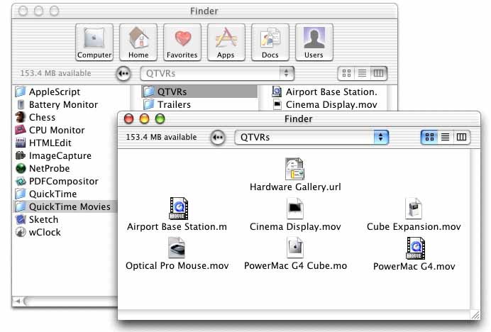
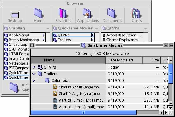
List view and column view coexist in separate windows: Under my proposal, double-clicking on a folder in the navigation window would open a new window with the contents of that folder. Shown here using Mac OS 9 with Greg's Browser. Note the window titles: one represents a browser dashboard, the other represents a folder. |
Under this arrangement, the user is never thrust from one environment and organizational philosophy to the other one unexpectedly. And the user's carefully-placed icons and windows are never moved around and resized except under the user's control. As Siracusa points out, this simple fact is of vital importance to the Mac user's feeling of control over her working environment.[4]
I now believe these goals can be accomplished in a way that draws from the unique strengths of Mac OS X and builds on them, bridging us forward from our existing habits and taking us into the projected future.
Thanks for your time -- and viva la revolution!
Sincerely,
Jon C. Thomason
Software Architect
Washington Apple Pi, Ltd.
[1] http://www.arstechnica.com/reviews/4q00/macosx-pb1/macos-x-beta-14.html
[2] Here I'm using the Desktop application's new window terminology, and extending it very slightly. A "Finder window" is a window belonging to the Desktop application (itself formerly known as the Carbon Finder). In my proposal, these "Finder windows" are always shown in Column View.
[3] Here I'm using a term of my own, a "Folder window", to describe the purpose and character of a window from the Mac OS 9 Finder and earlier.
[4] While remaining aware that folder and icon positions on a multiple-user machine are not guaranteed to be stored per-user. People have accepted this in the context of AppleShare, and I imagine they'll continue to accept it on single-user machines and while warming up to column view.
[5] http://www.kaleidoscope.net/greg/browser.html
In the mid-1980's, Jon was the teenager who wrote the Apple II software that runs the TCS, Washington Apple Pi's community bulletin board system. Since then, in his spare time he's spent far more time trying to "unwrite" that same software than he ever spent to write it. In 1996, he led the team that produced TCS Explorer, the Pi's in-house ISP cooperative. More recently Jon has tapped into the legacy TCS system using Apple's WebObjects technology, enabling the Pi to host its bulletin board on the Web simultaneously with its continuing telnet and dial-in services. This system is currently in private beta testing--watch for more details in future issues of the Washington Apple Pi Journal.